Juccebox
Roles:
Design, Concepting, Photography
File Under:
Identity Design, Packaging
Identity rebrand and packaging for portable vaporizer accessory company, Juccebox.
A New Identity
With the first round of drafts we stressed strongly on changing the brand image from fun and playful to conveying feelings of power, energy, and strength while staying aligned with the sleek visual communication of the tech market.
My initial stabs played with a few concepts that ranged from tying in a USB icon into the type, to creating different lightning/electric burst icons to pair with bold type.
When Juccebox came to me for a full company rebrand, the main point they wanted to focus on was steering away from any imagery that could be seen as marketing to the youth.
Their primary logo at the time was an actual juice box, along with another playful secondary mark that would appear now and again throughout their marketing and social with no true strategy to it’s use.
I saw a big need to establish brand consistency with this new mark, and try to prevent the random usage of secondary marks altogether.
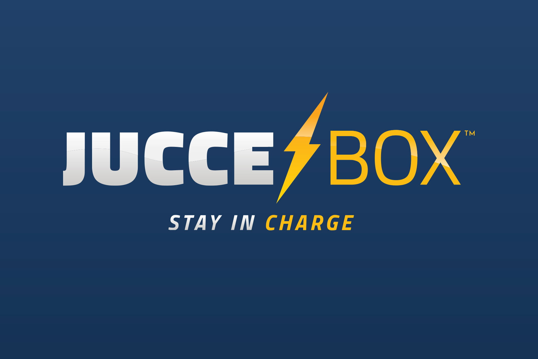
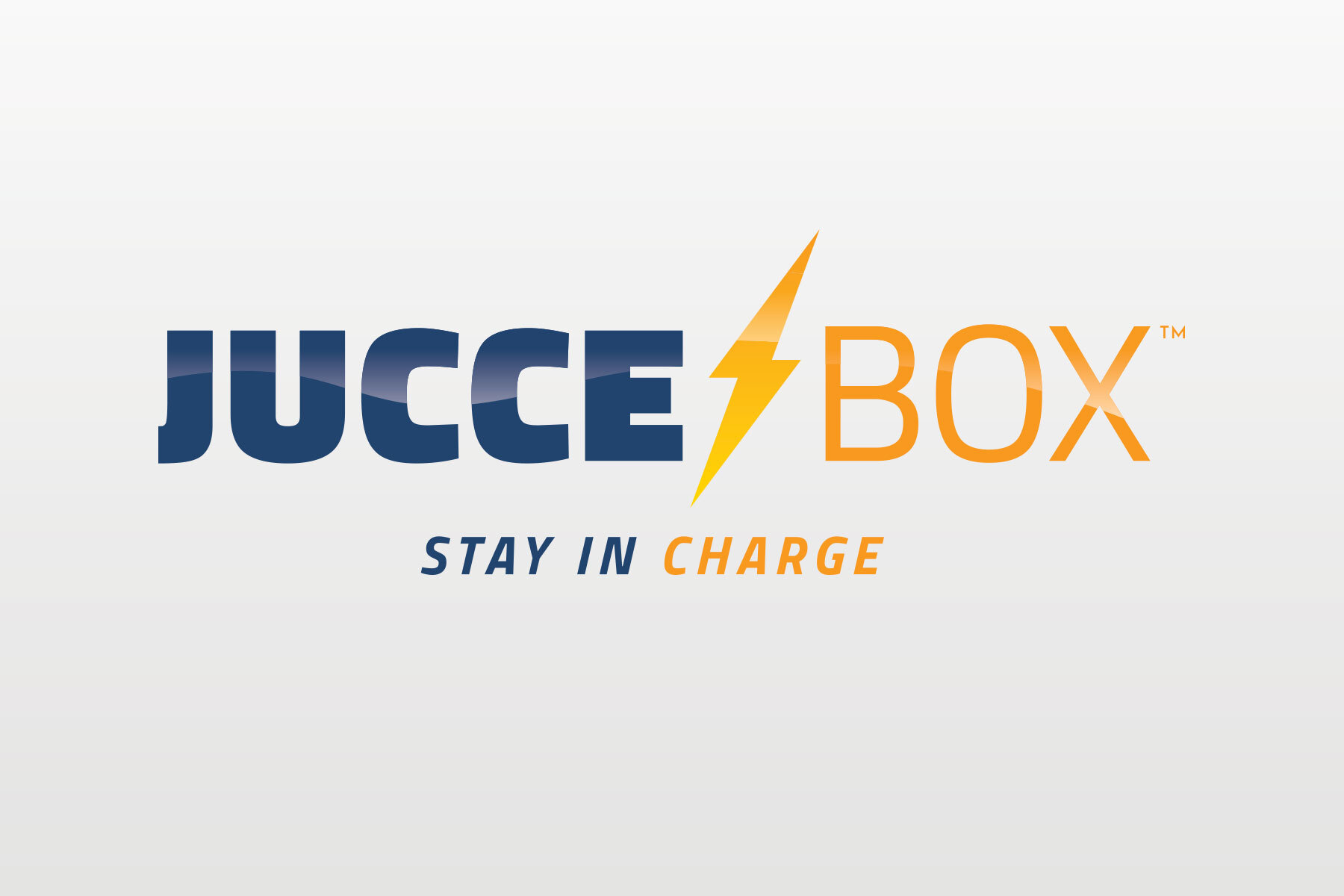
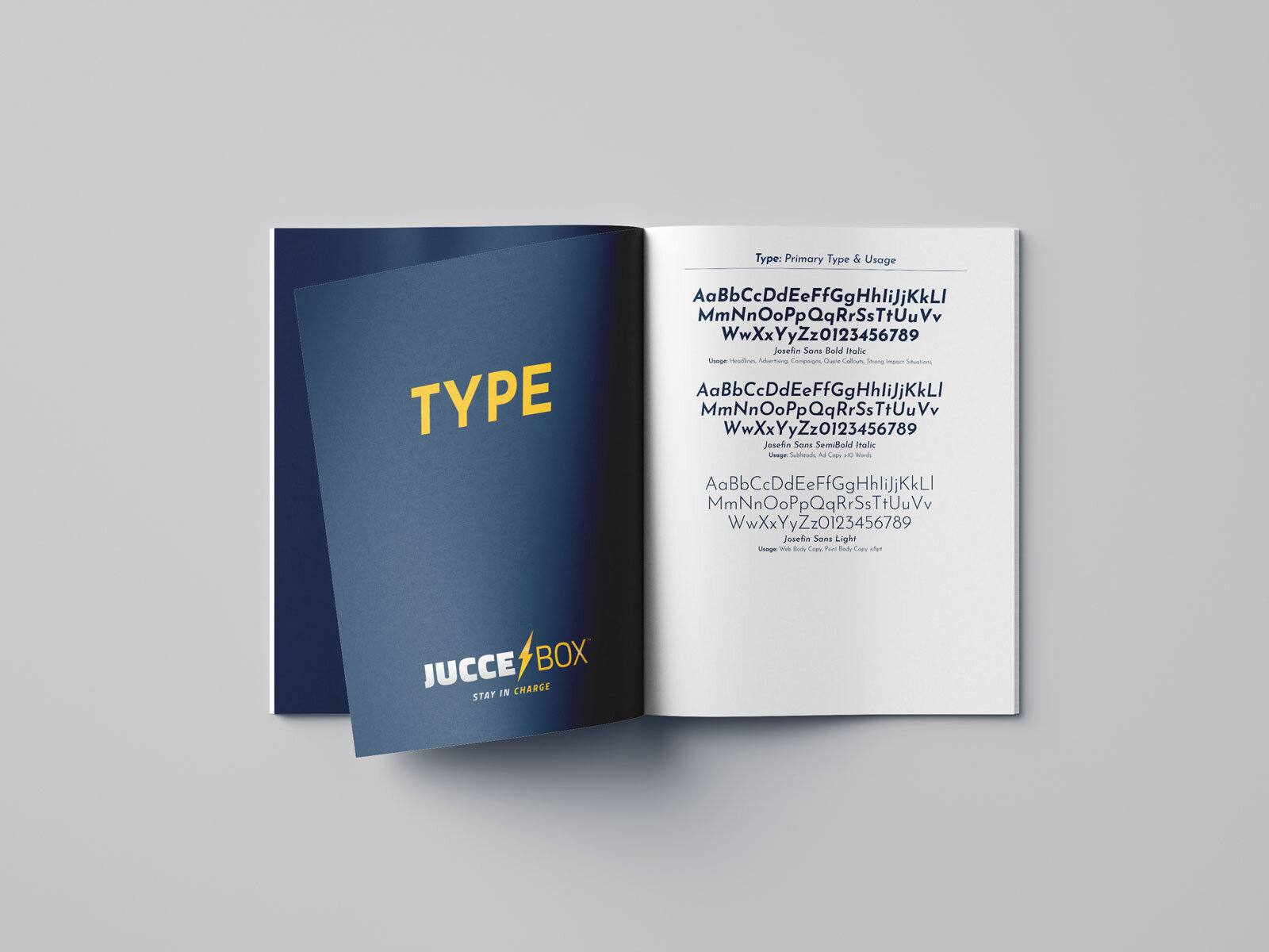
What we ultimately settled on was a simple lightning icon tied into a type lockup using the wonderful Titillium font family. I’ve been a fan of the sleek, tech feel of this family for a while and this felt like the perfect project to finally implement it.
Packaging
With the rebrand came another challenge beyond a less playful logo. Juccebox was now shifting gears from a primarily e-commerce brand to a product with eyes on retail shelves. While working on the packaging we wanted to create something that’s different, stands out, and really “pops” off the shelf.
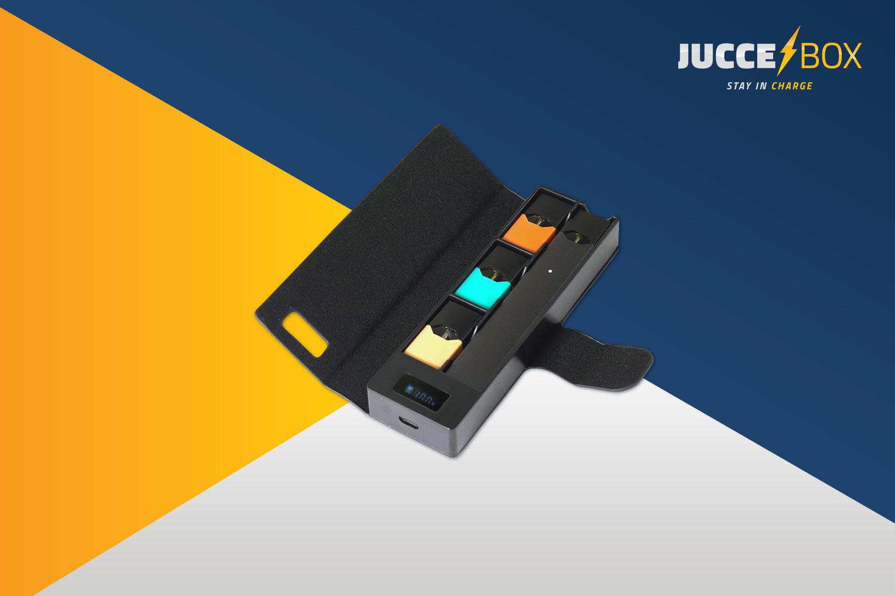
When looking at the vaporizer and portable charger markets I noticed a clear lack of color and vibrance across all of the packaging. We wanted to use the Lightning Bolt yellow combined with the orange from their signature charger colorway to create a high-converting gradient to span the packaging.
The final solution landed on a focus on the product photo, with clear and legible callout type blasted throughout. One of my favorite parts of this project was seeing this packaging come to life and seeing the Juccebox logo stamped into the back of all of the chargers.
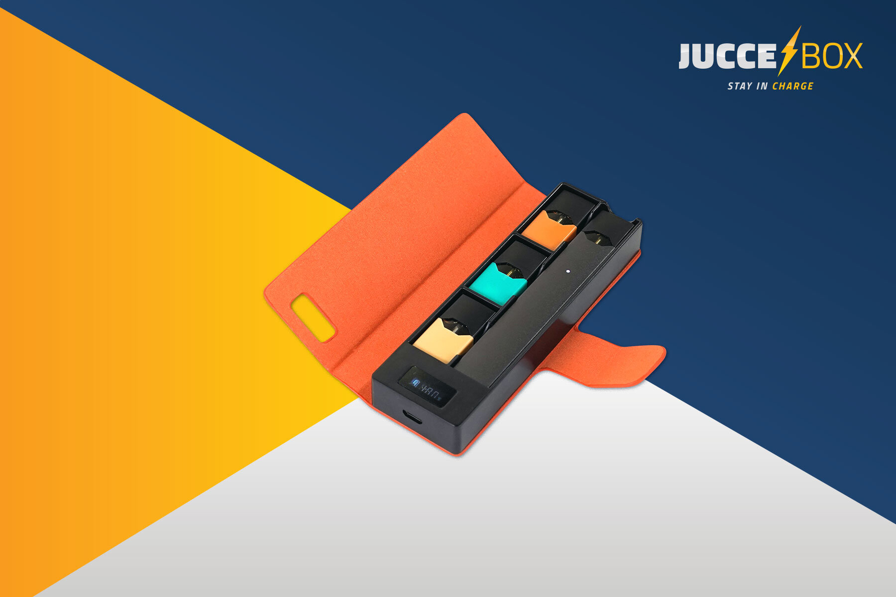
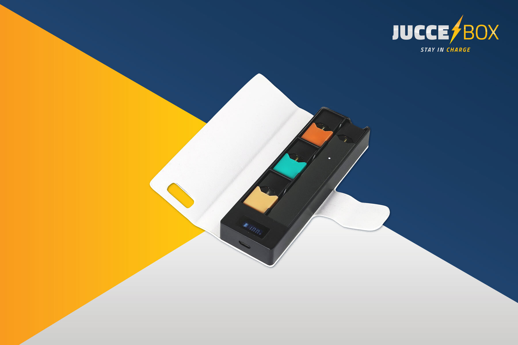
Product Photography
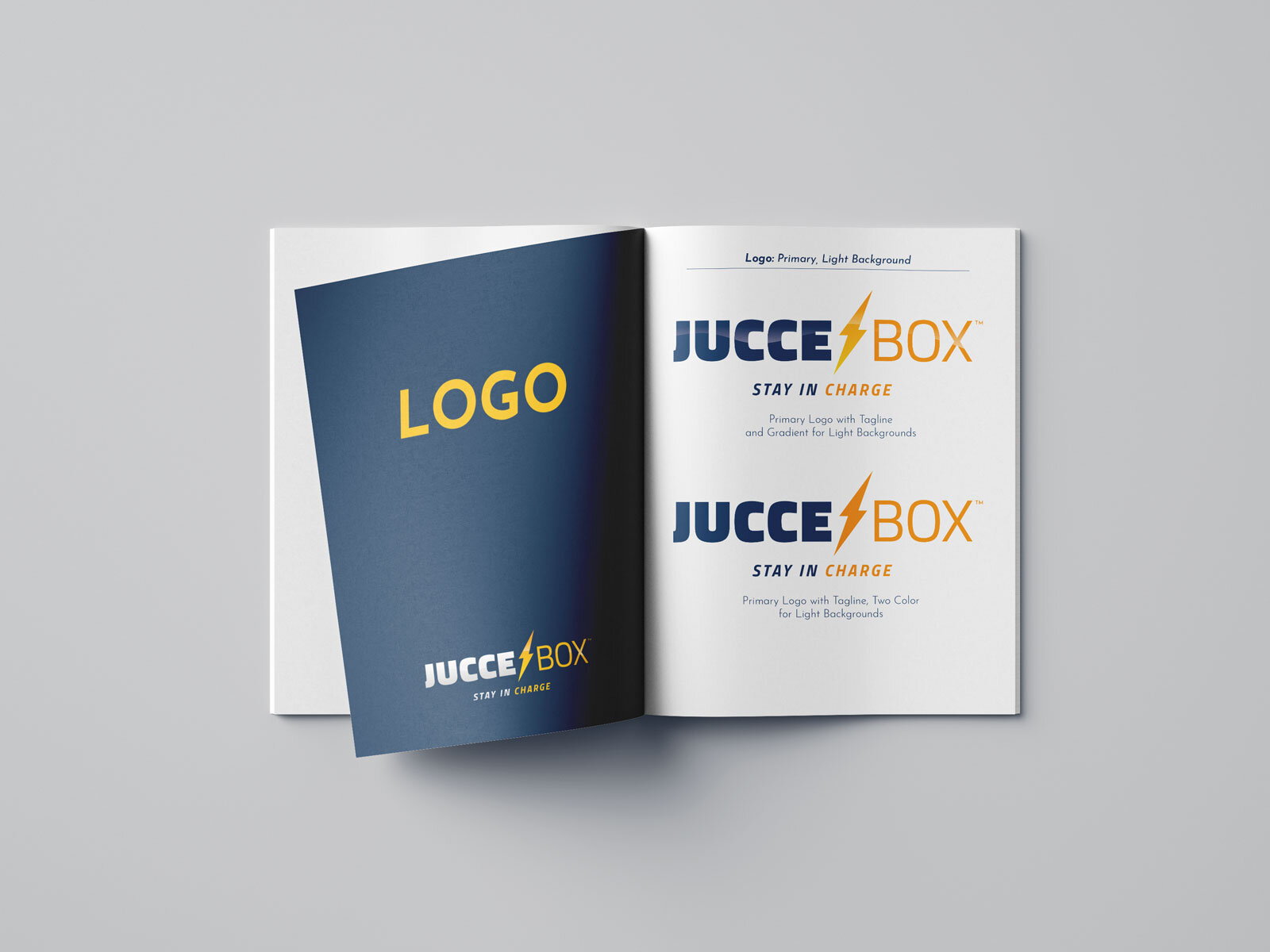
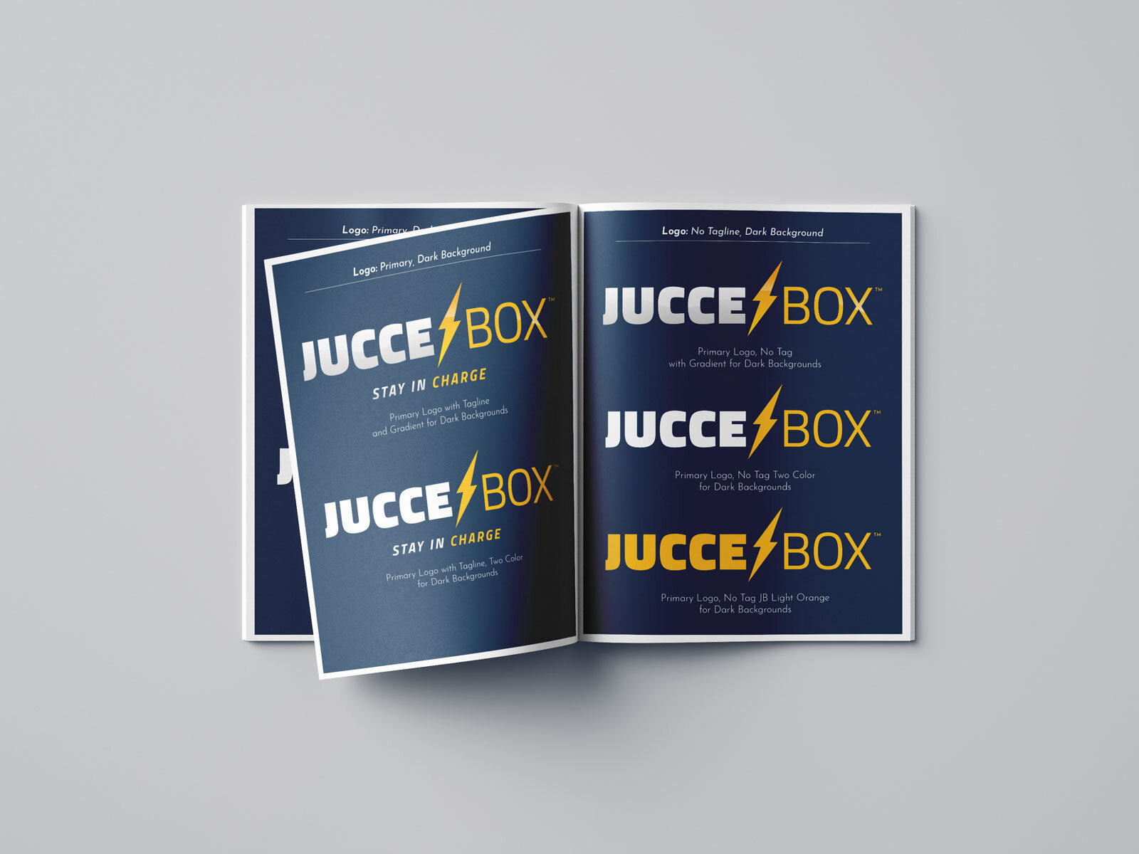
Brand Guidelines
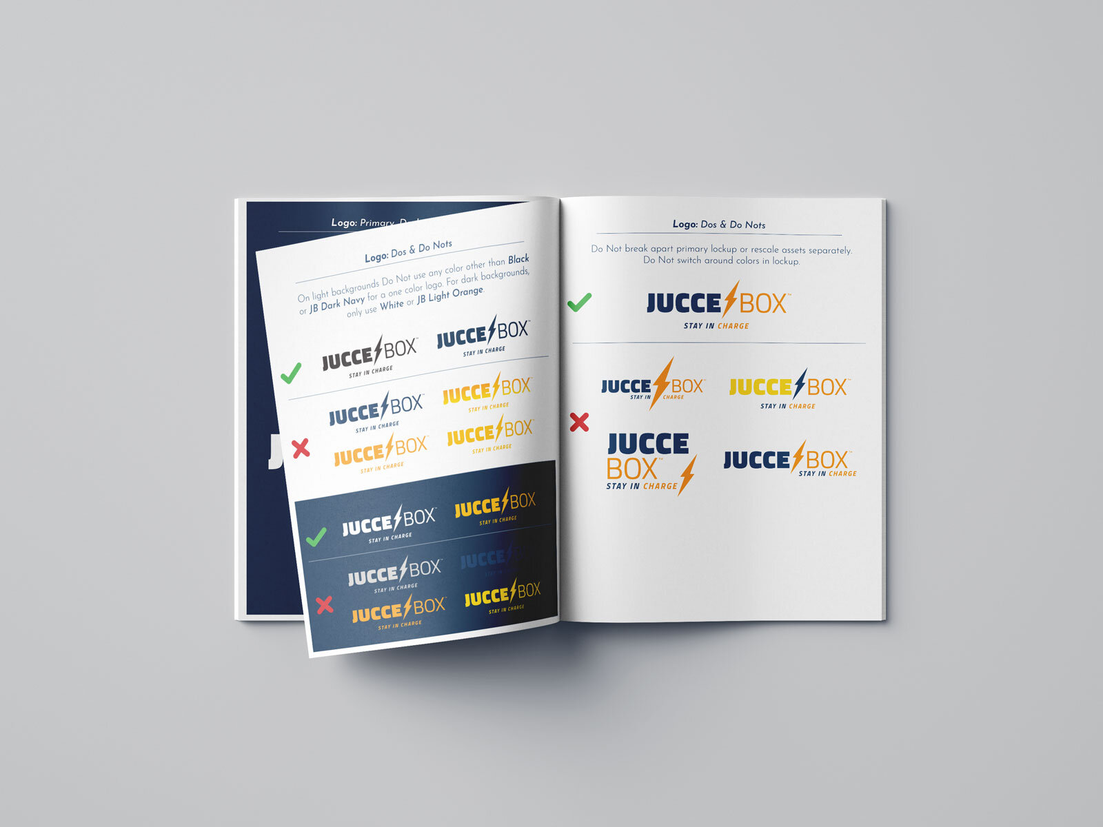
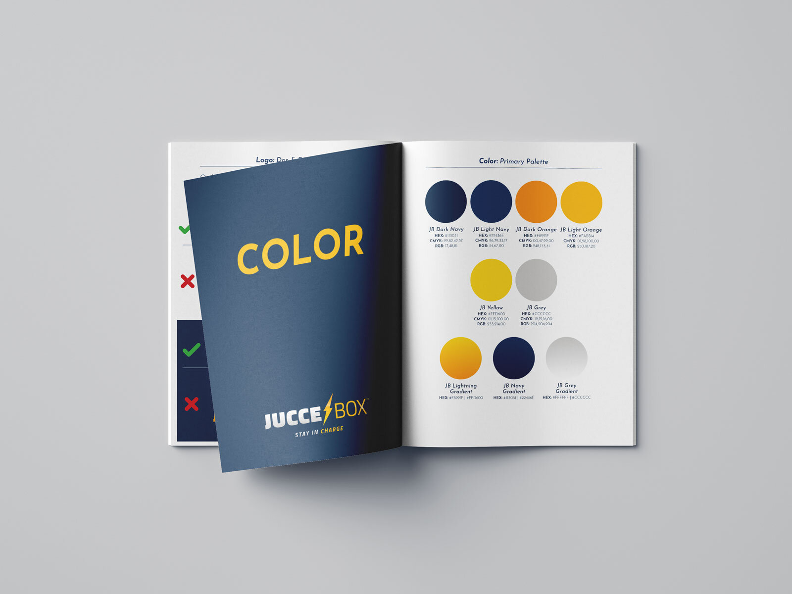
Upon project completion I built out a 30 page booklet of brand standards for the company’s future internal and external use.
