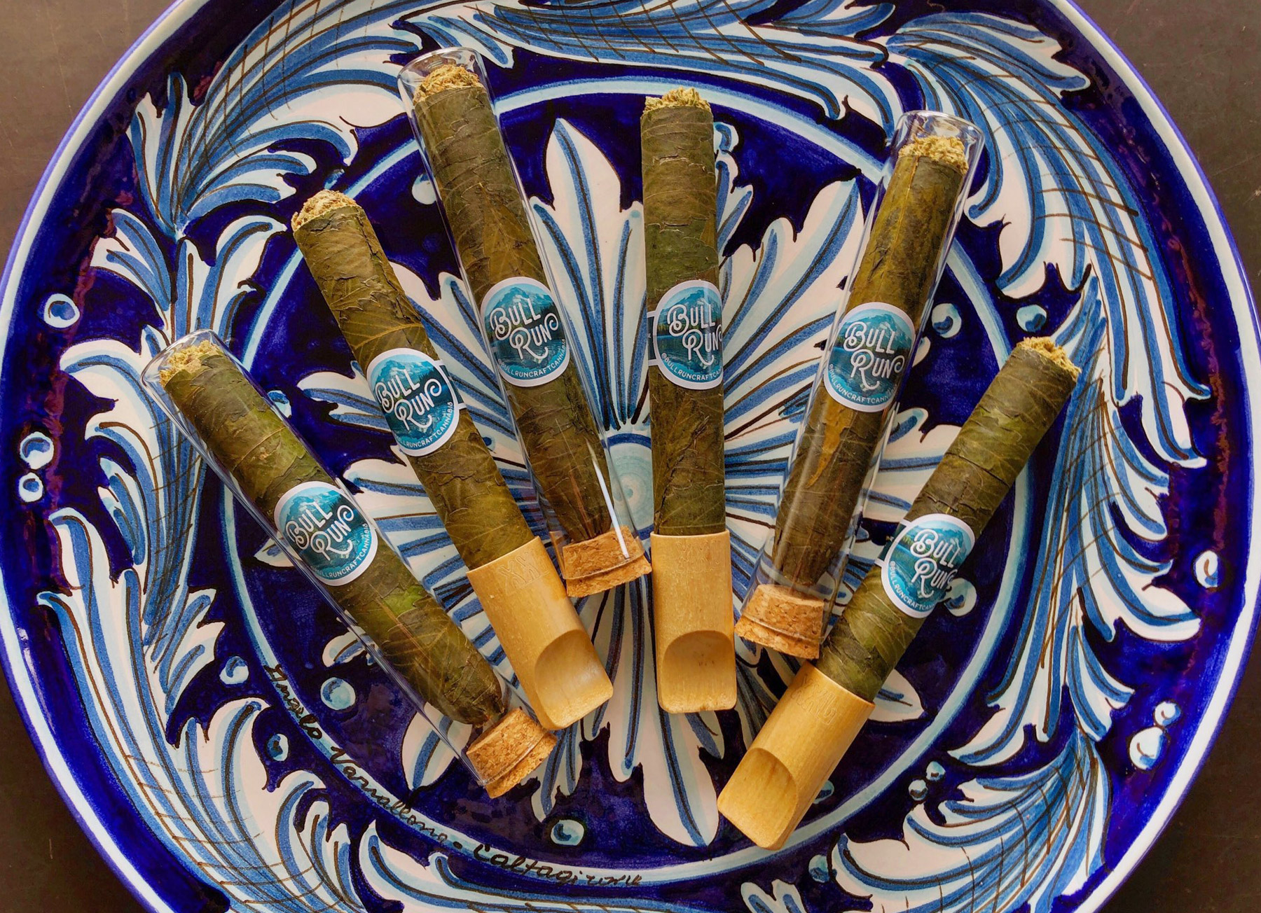
Bull Run Craft Cannabis
Roles:
Design, Brand Development
Credits:
Fish - BRCC Original Brand Identity
File Under:
Print, Packaging, Icon Design, Identity
Upon moving to Portland, Bull Run was the first name on a short list of local brands that I wanted to work with based on a personal appreciation of product quality, presentation, and overall brand aesthetic.
In the fall of 2017 I was roughly six months into full time freelancing and reached out to Bull Run via a contact form on their website. A few hours later I received a wonderfully warm email from co-owner John Plummer and the relationship has been rockin’ ever since.
Tri-Fold Informational Brochure
My first project with Bull Run was an informational leave-behind aimed to educate the consumer on terpenes and how they play into the flavor and effect of cannabis. My solution for this piece was a tri-fold brochure on an 8.5x11" sheet. The concept was to have the "meat" of the content (education on terpenes) be the big reveal of the inner spread once the trifold was opened. The lead-in pages before the terpenes education give an overview of the company story and their grow practices, while the back of the brochure covers the finer details, like where to find them on social media and what merchandise they currently offer.
A New Mascot
Heading into 2021, Bull Run wanted to start things off with a brand refresh that included a new owl mascot for the company. The purpose of this refresh was to create a recognizable “face” for the brand to be used on merchandise and collaboration product. Based on an owl sketch sent over from Bull Run owner, John, I developed the new owl icon, gave their type lockup a facelift, and established the color sets that our new owl icon will live in heading towards the New Year.
Strain Icons
A set of icons for Bull Run’s lineup of strains to be used in their C02 extract cartridge campaigns.
